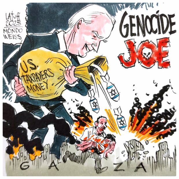
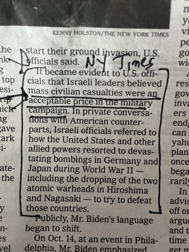
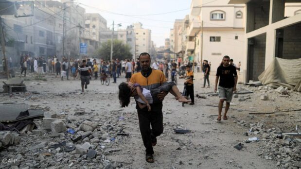
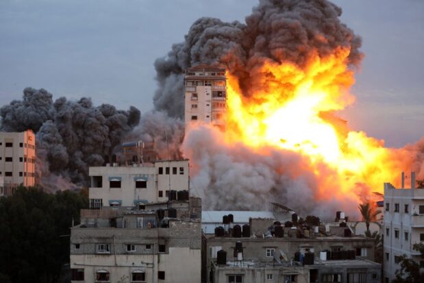
We will never ever forgive you for making Palestinians hold up their dead children in front of a camera just to prove Israel’s atrocities. They can’t even mourn in private because you won’t even believe them in the worst moments of their life. Israel kills them and you doubt them
— Farah-Silvana Kanaan (@farahkanaan) November 5, 2023
https://platform.twitter.com/widgets.js
Cops remove pics of Palestinians murdered by Israel outside WH:
— Bint (@PalBint) November 5, 2023
pic.twitter.com/0Fwe90jTWT
https://platform.twitter.com/widgets.js
View the first part of the stream from the pro-Palestine march in Philadelphia on Saturday night. Second part is above. 📽️
— UNICORN RIOT (@UR_Ninja) October 29, 2023
Thread: https://t.co/oqm26cJziK
More: https://t.co/vUPextfaU7https://t.co/iWb9HsVdyv
https://platform.twitter.com/widgets.js
“What is going on today in our name as American citizens is genocide.”
— AJ+ (@ajplus) November 4, 2023
Tens of thousands of people marched in Washington, DC, to protest Israel’s killing of nearly 10,000 people in Gaza. pic.twitter.com/OOamJ6MHkY
https://platform.twitter.com/widgets.js
About 300,000 people attended the pro-Palestine march in London demanding a ceasefire in Gaza.
— Al Jazeera English (@AJEnglish) November 11, 2023
— in pictures https://t.co/ItQszqBOMG pic.twitter.com/hkskWPSsCK
https://platform.twitter.com/widgets.js
Pro-Palestine march will be one of UK’s biggest ever protests, organisers predict https://t.co/CCKWD5FSdJ
— Guardian news (@guardiannews) November 10, 2023
https://platform.twitter.com/widgets.js
“You can come with your kippahs and you’ll face nothing but love from the people here.”
— Middle East Eye (@MiddleEastEye) November 11, 2023
Jewish protester, Maudi, who attended the pro-Palestine march in London on Saturday encouraged fellow Jews to show their support and attend demonstrations while wearing their kippahs pic.twitter.com/6tz4CdldSl


